The first one:
The second one:

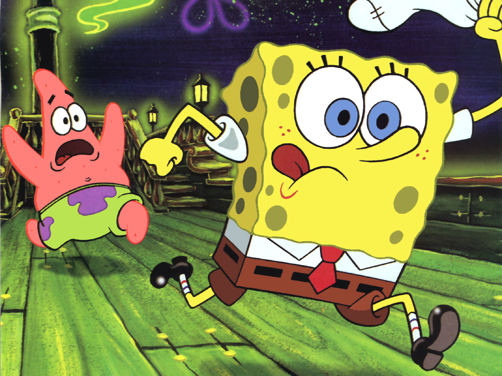
These two frames are very different from each other but contain the main character in each. What we first look at when viewing these two pieces is the color. In terms of hue, there are a lot of warmer colors in the second frame versus the first one. This shows a warmer environment especially centered around the lighter color of the main character, spongebob. Looking at the other characters in the frame, they have a darker color and this could be related to their expressions in the scene. Obviously they don't seem as cheerful as the main character and the animator decided to make their colors go along with it. The color in the first frame is a lot darker overall. The stress in both the characters in the shot is displayed on their faces and the color goes along with it. In terms of brightness, the first frame is a lot brighter in the front and especially on the main character. As depth goes on, the brightness gets significantly lower towards the people in the background. Even the characters right next to the main are a little dimmer than him. In the first frame, the environment around the characters is very dim and dark giving a suspenseful vibe to the scene. These different lighting techniques utilize shadows of the background characters in the second frame, and a darker mood in the first frame. Movement is also very important in these two frames. The first frame displays a large amount of movement as both characters in the shot appear to be in a frantic run. This shows fear in the shot and it is accompanied by the dark mood as explained before. The weight is a lot higher in the first frame over the second one because details are a lot more important and movement displays this easier.
No comments:
Post a Comment